let's light it up like a neon circuit board!
From the client:
'Let's channel our inner Tron here, folks! We're talking futuristic, sleek, and just the right amount of sci-fi cool. We've built this brand with purpose and precision, so let's light it up like a neon circuit board!'

That first direction sparked the creative process, setting off a chain reaction of ideas and possibilities.
Bam!
Sure, it's a bit of a stretch for a logistics company, but hey, who says we can't bring a little 'Bam!' to the visuals? I want it to really pop and break away from the sea of sterile, clean-cut competitors out there.
Scalable Style
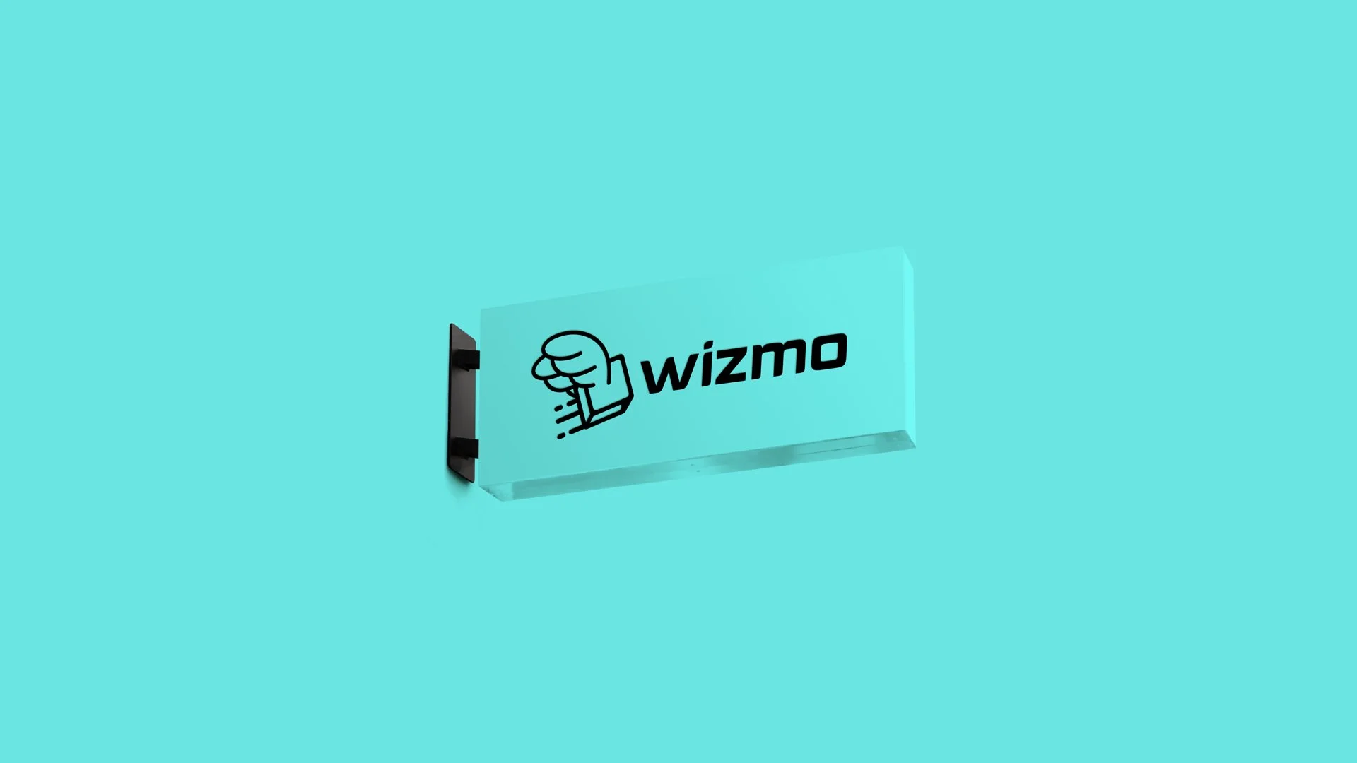
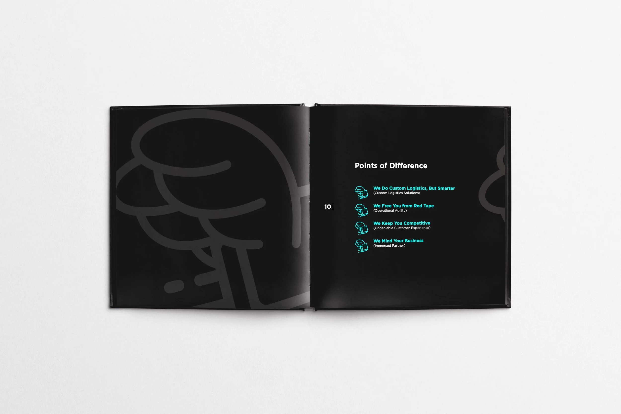
Alright, we’ve nailed the vibe—now let’s get strategic. We need to create a brand system that's not only cool but scalable and adaptable across every touchpoint. From the logo, typography, and colors to the tone of voice, imagery, and messaging, everything needs to work together seamlessly. This structure should be flexible enough to make an impact, no matter where it’s applied.
Making Waves,
On and Offline
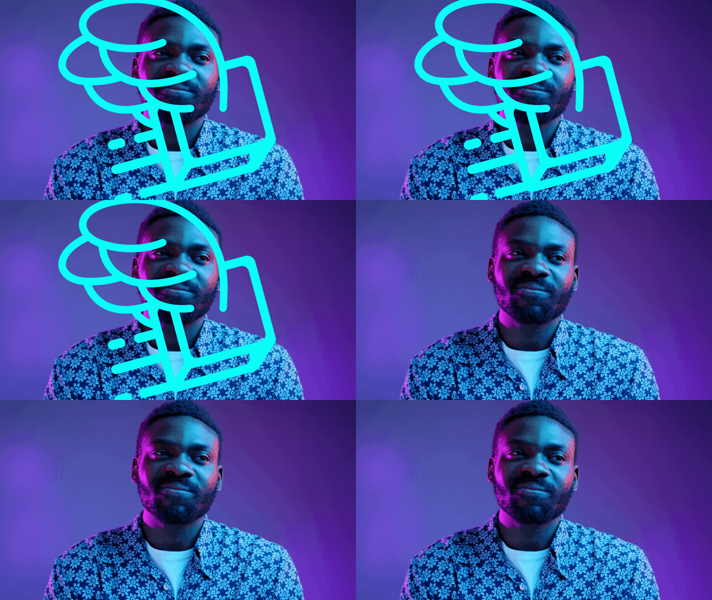
Once the brand is locked in, it’s time to bring it to life. We’re aiming for a bold, standout presence in digital media, but let’s not forget about offline visibility too. The goal? A holistic package that grabs attention and makes people stop, look, and get curious. We’re not just blending into the traditional logistics crowd—we're here to disrupt it and build a community that flips the script on the entire field.
Graig Radford and Alex Moore, Co-founders
“This rebrand isn’t just a new look - it’s a reflection of our commitment to creating better, faster, smarter logistics solutions for our customers”
Mark Yong, Wizmo Employee


